ShopDreamUp AI ArtDreamUp
Deviation Actions


Suggested Deviants


Suggested Collections


You Might Like…


Featured in Groups


Description
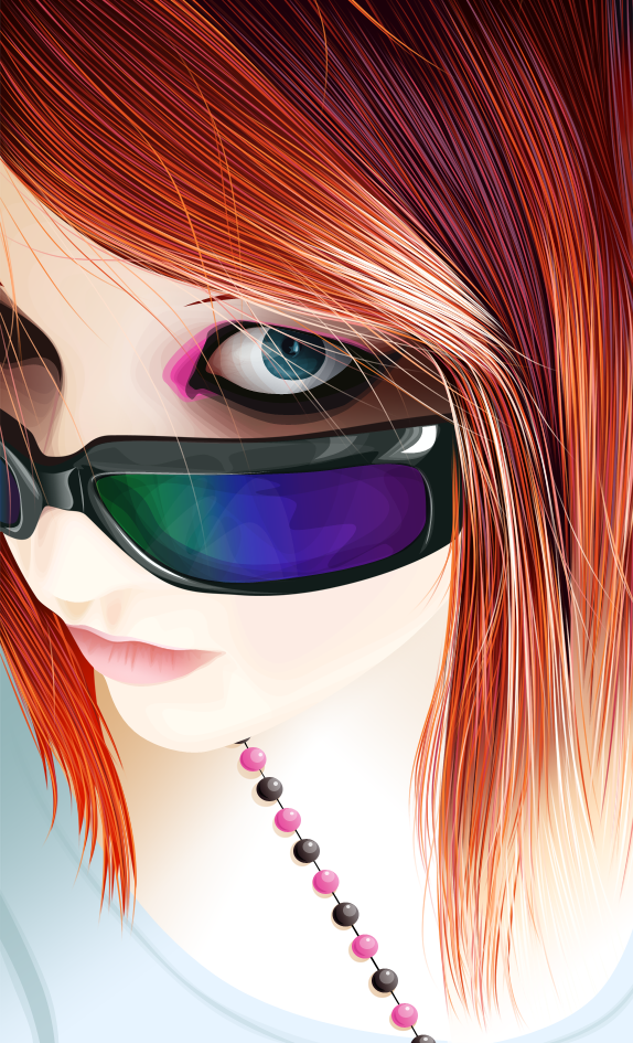
I thought it was about time I finished this one, so about 300 solid layers & 50 gradients later, here we go.
Original is 4000 pixels in height. I think I may have been insane working on something that big. I thought at times that Photoshop was going to completely give up
At first I was going for realism, but then I didn't due to what I said in my latest journal. So, here's the fun stylized almost-realistic version I went for instead.
Beautiful stock is Shades I by ~TearzStock
The tutorial on how I did the hair is here: [link]
Critique: General feel to the picture, brightness of the eye, shades, skin
Image size
574x945px 745.93 KB
© 2009 - 2024 VAngelLJ
Comments99
Join the community to add your comment. Already a deviant? Log In
Bold colours and high contrasts in this fabulous vexel. Not only that but there is a stock link and I love seeing the original stock compared to what has been produced to see what you've done to change it.
The contast, the colours in the shades, the changing of the colour in the beads, the simplifying in the hair... very well done.
However I do have a few critisms which you might want to consider for your next vexel:
After seeing your wonderful hair tutorial, I must admit you've set the bar for yourself on that... and you have definately hit it. The hair looks fantastic. However I feel the top 50 or so pixels would benefit from being cropped off. Because you've used such bold colours ontop of a dark layer, the hair detailing doesn't look to actually start until after this 50 pixels or so and as you skim your eyes down, it kind of seems a little out of place.
To prevent this, you could either crop this out of the image, other add darker colours from the top, or start the hair strands from above the actual canvas and draw downwards (if photoshop doesn't allow you to do this then increase the size of the canvas and crop afterwards).
As you see, I'm not that skilled with photoshop.
Although I really like the colours in the shades and they definately help add more colour and an impact to the vexel, I think because you've used gradients towards the bottom of the vexel and within the hair, using fewer shapes of gradients in the shades would have made them look a lot more smooth... the same with the highlighting on the frame.
One thing I would advise is putting more detailing in the eyes. You could use the same technique of using stroke path as detailing in the iris. It would work very well, especially with it being so close to her fringe. Or bangs if you're Americanly inclined... oh my new word!
The skin is gorgeous... skin doesn't get the attention it deserves on vexels and I believe has been done very well. Very soft and almost velvet like which adds a great base to the bold almost sharp contrasts of the hair.
I keep going back to the hair because it's such a wonderful element in this vexel and definately the focal point in my opinion. You've definately got that technique down to a tea.
You've definately set your own personal bar high with this one, an amazing piece.